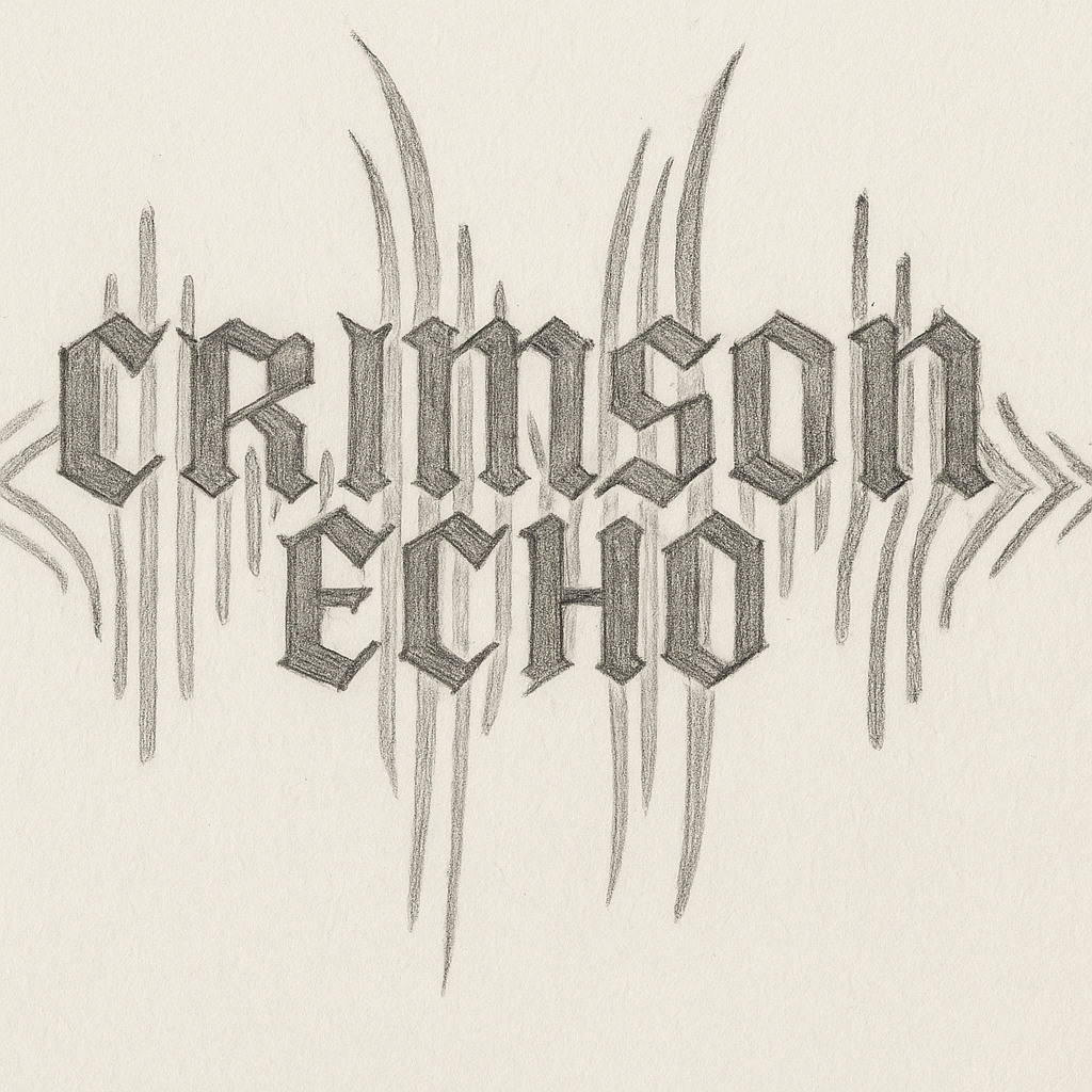
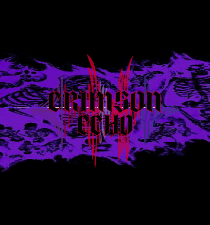
The creation of the Crimson Echo logo started with a search for a visual identity that could truly reflect the essence of the phonk genre. Phonk is raw, dark, and bass-heavy — a sound born from underground culture and soaked in nostalgia and aggression. The logo needed to capture more than a name; it had to express a feeling.
The use of gothic-style typography was intentional. The sharp, heavy letterforms echo the gritty atmosphere of phonk and its roots in 1990s Memphis rap. It represents strength, rebellion, and a timeless aesthetic — just like the music itself.
The name Crimson Echo combines two powerful contrasts: “Crimson” suggests intensity, blood, and urgency — emotions often evoked in phonk. “Echo” references the lo-fi, atmospheric layers, repetitive samples, and reverberating vocals that define the genre’s haunting sound.
What makes the logo unique is the presence of wave-like distortions around the text. These aren’t random visuals — they symbolize how phonk’s sub-bass physically shakes space and distorts sound. The waves are irregular, blurred, and aggressive — a visual interpretation of what the bass feels like when it hits.
The blurriness in the shapes also represents the analog imperfections, noise, and saturation found in phonk production. Instead of striving for perfection, the logo embraces imperfection and chaos — just like phonk itself. It’s not meant to look clean — it’s meant to look powerful.
Finally, the logo was designed with adaptability in mind. It’s strong and recognizable enough to live across merchandise, video intros, and web design. It isn’t just a logo — it’s a visual signature of a sound movement.